If you’re wondering why your pet or veterinary website isn’t bringing in the volume of sales or leads you expect… it may be due to your site’s “First Impression.”
Let me explain. I’m always following web industry experts who measure different aspects of what works with search engines and site visitors… and recently I came across some alarming statistics.
The statistics have been gathered through global tests involving millions of websites. They point to a few critical fundamentals that make a huge difference in whether your pet or veterinary website’s First Impression is going to attract buyers or turn them away.
First, a few eye-opening facts gathered through scientific website tests:
1. Website user viewing time is distributed as follows:
- Above the Fold (the first screen area viewed on a website): 80.3%
- Below the Fold (the area that requires scrolling to be seen): 19.7%
This means most of your online visitors only look at the first screen of your site before moving on. They’re very unlikely to scroll or click to another page if the Above the Fold area doesn’t grab their attention.
2. “The first 10 seconds of the page visit are critical for users’ decision to stay or leave. The probability of leaving is very high during these first few seconds.”
The first 10 seconds count more than anything, which means a slow load time can be deadly.
3. In a recent global study involving 1 million websites, just 9.6 percent of the sites had “all the basic web page elements covered correctly.”
This means 90.4% of website are NOT covering even the most basic user-friendly elements to ensure success. Astounding.
To me, these statistics underscore the importance of making a great First Impression on your site within that 10-second window, whether you’re marketing pet products, pet services or veterinary products or services.
Based on this information, I decided to create a Top 5 list of what makes a great First Impression. These are the 5 must-have factors any pet or veterinary website should have:
- Quick load time
- Clarity
- User friendliness
- Visitor engagement
- SEO fundamentals
Then, armed with my Top 5 list, I evaluated the 10-second First Impressions of 303 websites in the pet industry (pet service businesses, veterinary companies, pet products and many others). My findings were similar to the industry experts… just 1 in 6 websites met my criteria for a successful 10-second First Impression.
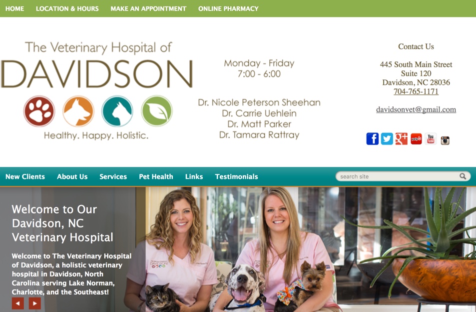
Here’s a website that gets a great score. The Veterinary Hospital of Davidson does a nice job of covering all 5 factors, as you can see from this photo (or check out their website for a better view):
- It loads very quickly. On my browser, I saw the entire home page in about 1 second.
- What they offer is instantly clear in the logo, tagline, headline, photos, captions, and everywhere else (By the way, I love their real staff photos. So much better than stock images.)
- The navigation and overall design are very user-friendly. Everything’s located where you expect it, so you can quickly find what you need.
- When it comes to engagement, you’ll find Facebook and Twitter links right away, up in the masthead… plus they invite you to watch a video about their practice.
- They’ve included all the critical SEO elements, weaving local keywords into strategic content locations.
That’s a great example. You can see many more in a report I created to explain how a few focused corrections can improve your 10-second First Impression in a big way. I called the report, “Your 10-Second Solution for a More Profitable Pet Website,” because you’ve got just 10 seconds to grab people and lead them to doing business with you.
Do me a favor please? After you read the report, can you let me know what you think of it? I’d really like to know if the information is useful to you. That’s my goal!
Until next time,
Here’s to a prosperous pet website!
Pam Foster
PetCopywriter.com
Sources:
Facts 1 and 2: Alertbox.com
Fact 3. www.contentmarketinginstitute.com/2012/07/seo-fundamentals-that-google-cant-ignore/

